Read your dashboard
The dashboard is the first page you see after you log in. It answers one question: where do my customer accounts stand today, and where are they heading. Twelve tiles are grouped into seven sections, and every tile opens a window that shows the numbers behind it. This article walks through the page, its controls, and the detail windows.
Before you start
- An invoice source must be connected. The dashboard reads the customers, invoices, and payments Finaxis has synchronized.
- The figures cover the accounts you are allowed to see. If customers are assigned to you, the page opens on your own portfolio.
Open the dashboard
- Log in to Finaxis at app.finaxis.ai. The dashboard opens on its own.
- In the left menu, under METRICS, click Dashboard to come back to it from anywhere in the app.
- Read the header. It greets you by name and gives the date the figures describe.
- Use the All owners list to scope the whole page to a single account owner.
- Click the refresh icon (Recompute the data) to force a fresh calculation from your latest synchronized data.
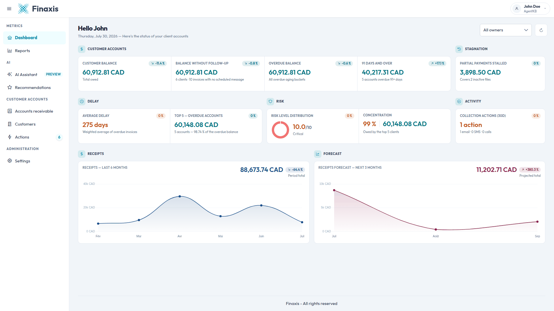
Please note: Every amount is shown in your instance base currency, printed next to each figure. Change your display currency and the page re-expresses the amounts in it.
Scope the page to one account owner
The list at the top right filters the entire page. All owners covers every customer on the instance. Picking a person narrows all twelve tiles to the customers assigned to them, so you can read one portfolio at a time.
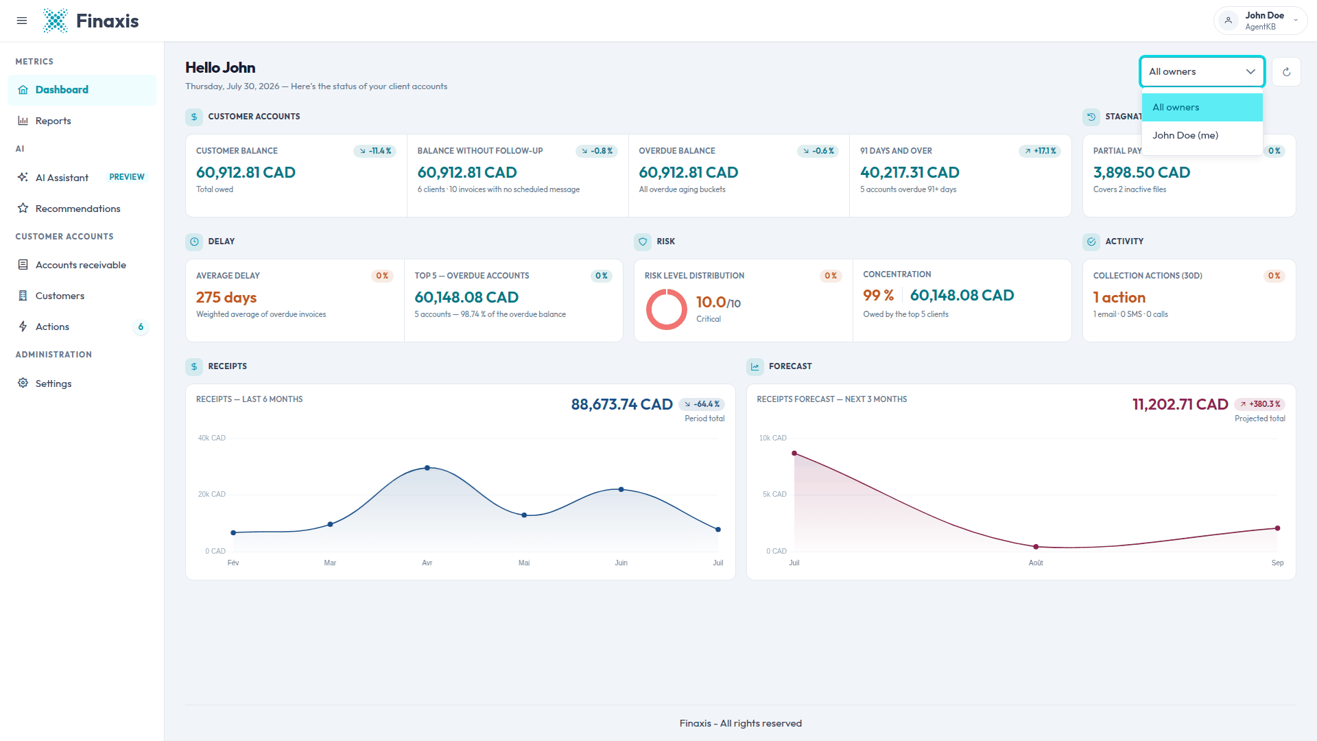
Please note: Each detail window carries its own copy of this list. Changing the owner inside a window affects that window only, and it resets when you close it.
The seven sections and their tiles
The tiles are laid out in three rows. Read the first row for the money owed, the second for how bad it is, and the third for the cash coming in.
| Section | Tiles | The question it answers |
|---|---|---|
| CUSTOMER ACCOUNTS | Customer balance, Balance without follow-up, Overdue balance, 91 days and over | How much is owed to me, and how much of it is late. |
| STAGNATION | Partial payments stalled | Which part-paid invoices have gone quiet. |
| DELAY | Average delay, Top 5 — overdue accounts | How late my open balance is, and who carries most of it. |
| RISK | Risk level distribution, Concentration | How risky my portfolio is, and how much of it sits on a few names. |
| ACTIVITY | Collection actions (30d) | How much chasing my team has actually done. |
| RECEIPTS | Receipts | How much money came in, month by month. |
| FORECAST | Receipts forecast | How much I can expect over the next three months. |
Read a variation badge
Most tiles carry a small badge next to the value, showing the change against the previous comparable period. An arrow gives the direction. On the balance tiles a drop is good news, on the receipts tiles a rise is.
Please note: Five tiles currently show a neutral 0 % badge whatever your data does: Partial payments stalled, Average delay, Top 5 — overdue accounts, Risk level distribution, and Collection actions. On those five, open the tile and read the trend chart instead of the badge. The Concentration tile carries no badge at all.
Open a tile to see the detail
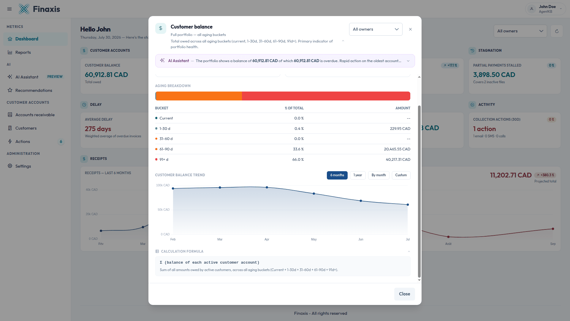
- Click any tile. A window opens over the page, and only one window is open at a time.
- Read the line under the title for the short definition, then click the chevron at its right to expand the full definition.
- Read the AI Assistant note at the top for a plain-language summary of what the figure means and what to do next.
- Read the stat boxes, then the breakdown table under them.
- Scroll down for the trend chart and the calculation formula.
- Click Close, or press Escape, to go back to the page.
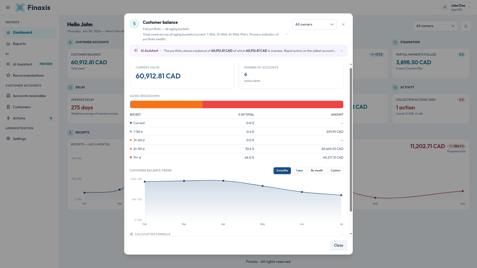
In the Customer balance window, the rows of the aging breakdown are clickable. Click a row and Finaxis opens your accounts receivable list filtered on that age range, so you go straight from the figure to the customers behind it.
Please note: The AI Assistant note is a written summary attached to the tile. It is not a reply from the assistant and you cannot type into it. To ask your own questions, use AI Assistant in the left menu.
Change the period of a trend chart
- Open a tile and scroll to its trend chart.
- Click 6 months or 1 year for one point per month.
- Click By month for one point per day across a calendar month.
- Click Custom, then pick a start and an end date in the date field that appears. The chart switches to one point per day.
- Change the owner in the window to redraw the same chart on that person's portfolio.
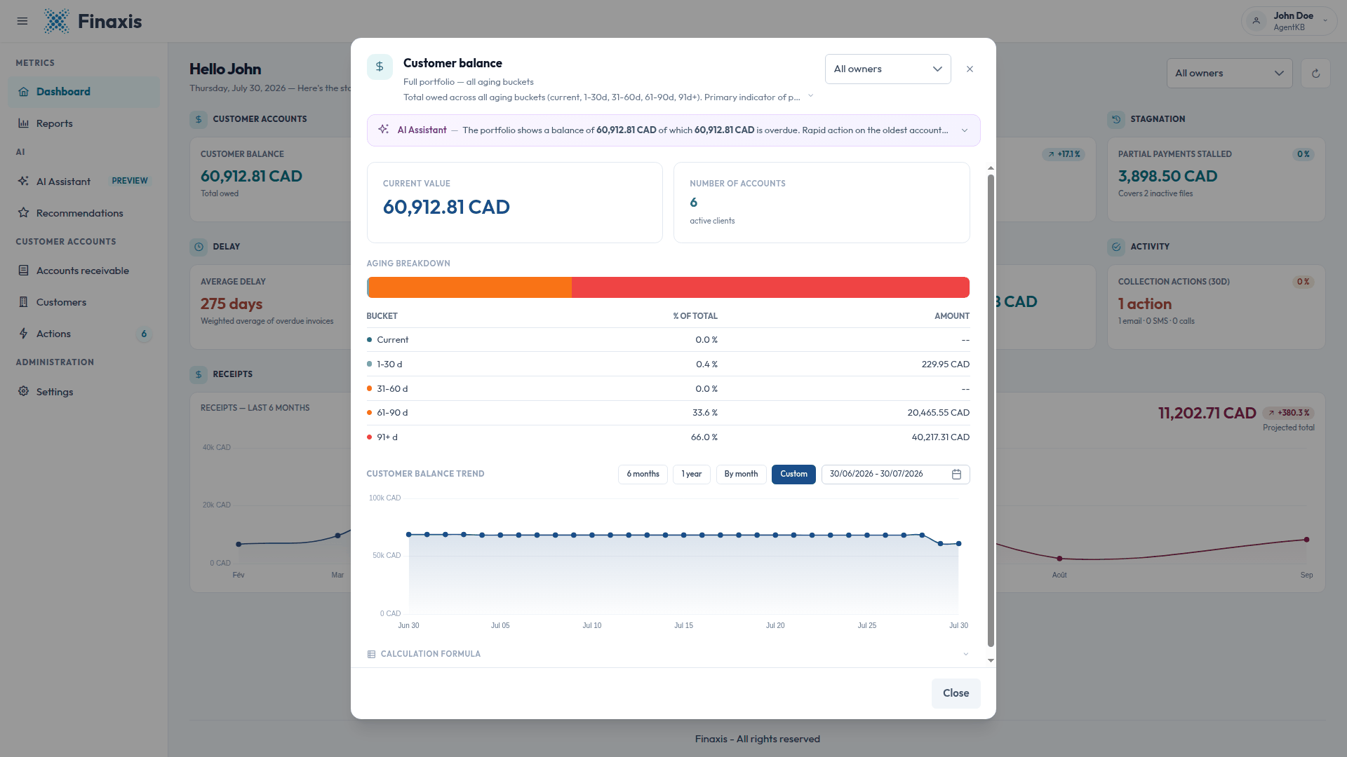
- Each window keeps its own period. Setting one window to 1 year leaves the others where they were.
- The chart loads when you open the window, so give it a moment on the first view.
- Ten of the twelve windows have a trend chart. Top 5 — overdue accounts and Concentration describe a moment rather than a movement, so they have none.
See the formula behind a metric
Every window ends with a Calculation formula panel. Click it to expand the exact calculation and a sentence of plain language explaining it. Use it whenever a figure surprises you, or when you need to explain a number to someone else.
Set your company objectives
Several windows compare the live figure against an objective. You set those objectives yourself, and they apply to the whole instance.
- In the left menu, under ADMINISTRATION, click Settings.
- Stay on the Company tab and scroll to Company Objectives.
- Fill in Target unpaid portfolio balance, Collection target per month, % unpaid after 91+ days, and Target average payment delay.
- Save. The matching windows now show your objective next to the live figure.
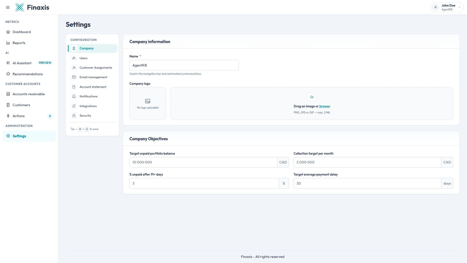
Please note: The greyed figures in those four fields are examples, not values. Until you save your own, the windows fall back to built-in reference values, such as < 30 days for the average delay and < 5 % for the 91 days and over share. You need the settings permission to edit them.
Where each number comes from
Finaxis measures your receivables on three surfaces, and they answer different questions. Two of them use similar words for different calculations, so it is worth knowing which one to open.
| If you want to know | Open | Because |
|---|---|---|
| How late the money owed to you is right now | The dashboard tile Average delay | It measures the time between an invoice due date and today, weighted by amount. It describes your open balance. |
| How long your customers actually take to pay | The Reports section of the menu | It measures the time between an invoice and the payment received. It describes money already collected, not money still owed. |
| Who to chase, customer by customer | Your accounts receivable list | It is the aging report: one row per customer, the aging columns, and a payment risk badge you can filter on. |
| How risky your portfolio is overall | The dashboard tile Risk level distribution | It reads each customer payment history. The badge on the aging report reads the aging mix of that one row instead, so the same customer can carry a different level in the two places. |
| How much came in over a period you choose | The Reports section of the menu | The dashboard Receipts tile follows the period set inside its own window, so the two totals describe different windows unless you match them. |
Troubleshooting
| Situation | What to do |
|---|---|
| A tile shows a 0 % variation | Five tiles always show a neutral 0 % badge. Open the tile and read its trend chart to see the real movement. |
| Two tiles show the same amount | That is expected when every open invoice is already overdue, or when no customer has a scheduled message. Read the small label under each amount to tell them apart. |
| The figures look out of date | Click Recompute the data in the header. Finaxis recalculates from your latest synchronized invoices and payments. |
| A notice sits above the tiles | A notice appears while a first import is still running, when part of the calculation could not be completed, or when a refresh failed and the previous figures are still on screen. Retry from the notice. |
| A trend chart stays empty | The chart is loaded when you open the window. Wait a moment, then switch the period to reload it. |
| There are no tiles at all | No invoice source is connected yet. Connect QuickBooks, Acomba, or an invoice import first, then come back. |
A figure you cannot reconcile? Expand its Calculation formula first, then write to support@finaxis.ai with the tile name and what you expected.
Related articles
Can't find what you're looking for?
Our support team is here to help.